In the video below, myself and Kirstie went about making a tutorial on how we got the 'Identity Credits' for our artist into the start and end of our video. The reason why we out these credits in the video in the first place was because we felt that it would give our music video a professional feel, as if it were going to be shown on a music channel like MTV for example.
Showing posts with label Editing. Show all posts
Showing posts with label Editing. Show all posts
Thursday, 21 February 2013

Friday, 15 February 2013


Wednesday, 30 January 2013
Peer Assessment - SMART Target
Today, myself and Kirstie viewed Becky and Stevie's version of our edited music video. Once we had watched, one pair gave feedback in regards to the following S.M.A.R.T Targets:
- Specific - Part of the footage, part of the video to improve?
- Measurable - Can we tell when they have done it?
- Achievable - Make sure that each piece of advice/adjustment is achievable?
- Realistic - Not filming new stuff, no explosions, etc.?
- Time bound - Can these targets be done within this lesson?
For our music video in its current state, we were given the following targets for feedback:
1. For certain clips that we have used, try and line them up so they fall on the syllables of the lyrics rather than the beat of the soundtrack (in certain cases, however).
2. In regards to effects that we have used already, try and use them on parts of the soundtrack that will be rememberable, e.g. on the chorus.
3. Don't over-use a particular effect and keep it to a certain part of the soundtrack so it doesn't get over-repetitive through its constant use. Effects such as the blue colour filter we have used, we were suggested, should be confined to one section of the video.
Wednesday, 9 January 2013
Initial Editing Problems
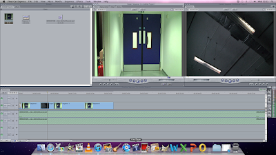
In the beginning parts of our editing phase of our music video, we have already encountered a few problems, mainly in the ordering of shots and dealing with jump cuts between the different shots we have used., meaning that the music video doesn't really flow properly without visibly seeing the jump within the footage. To fix this problem, we have decided to put in other clips from our footage so the jump cuts are not as obviously visible. For example, the door is opened up by one of the actors but in the next shot, as the door is closing, the camera positioning jumps. So to fix this, we put a clip of the room's lights turning on and then put the footage of the next person coming through the door. We will not be able to use this method every time, however, so we will have to find another alternative of fixing this problem.
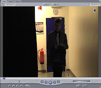
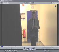 Another problem we had was with the brightness adjustment of the clips. Upon looking back on the the footage we filmed, a number of the shots were slightly too dark to possibly use in the final music video. Because of this, we tried to adjust the brightness of the clips to see if it made thing any better. A 'before' (left) and 'after' (right) still of this change shows the difference made. As you can see, the light from behind the actor shines directly in the lens of the camera, creating the 'silhouette-like' figure of our actor instead. The brightness effect does make a difference, you can now see the actor's face in the footage as well as other features, however it does now make the clip look like it has unnatural light, something that we have decided doesn't work, which has led to the decision not to use it at all
on any of our clips.


 Another problem we had was with the brightness adjustment of the clips. Upon looking back on the the footage we filmed, a number of the shots were slightly too dark to possibly use in the final music video. Because of this, we tried to adjust the brightness of the clips to see if it made thing any better. A 'before' (left) and 'after' (right) still of this change shows the difference made. As you can see, the light from behind the actor shines directly in the lens of the camera, creating the 'silhouette-like' figure of our actor instead. The brightness effect does make a difference, you can now see the actor's face in the footage as well as other features, however it does now make the clip look like it has unnatural light, something that we have decided doesn't work, which has led to the decision not to use it at all
on any of our clips.
Thursday, 13 December 2012
Footage Filmed! & Digipack Shots.
On the 12/12/12, our group went out and we filmed the footage we needed for our music video. On the day, we did not have our storyboards right away so a few shots were from memory. Here are some pictures of our filming experience:


After we filmed, I took some pictures myself of various things that will make an appearance within the footage we have gained. These pictures are hopefully going to be used in the production of my digipack and website once edited to fit along with my chosen colour scheme. Below are the pictures I took:


This is a picture of how the lecture seating ends up towards the end of the narrative of our music video. We feel that having these seats empty by the end of our music video will easily make the proposed narrative much more straight forward to conclude, as each individual 'student' we have in the apparent 'lecture' will each, one-by-one, leave as the artist's persona slowly declines into his madness.

This was the set-up of the teacher's desk that was included within a number of our shots. We had the idea that as he begins to get mad, he should slide his things off of the desk and then when we come to edit, we can add certain effects onto it like slow motion for example.

This picture shows a slide from the powerpoint that will be displayed throughout many of the different shots of footage we got. This powerpoint will be focussed around a theme that links in with the lyrics of our chosen soundtrack - "...blame it on my ADD baby...' We thought that this would be the most fitting way to link the narrative to the soundtrack itself.

This is one shot that I have already chosen to be in my digipack. This is simply a close-up shot of the chair layout within the lecture theatre. Once I have edited this picture, it will definitely be used on my digipack layout, either as an inside cover or as the back cover, but it will require some form of editing first. The layout of the students in the lecture theatre had to be planned out at first so it was easy for people to get out of the row of seats they were in and exit the shot in a decent space of time.

After we filmed, I took some pictures myself of various things that will make an appearance within the footage we have gained. These pictures are hopefully going to be used in the production of my digipack and website once edited to fit along with my chosen colour scheme. Below are the pictures I took:

This is one of the slides from the powerpoint we used within our footage. For my digipack, I had the idea to follow with the theme of being in school. This is because I can make all of my products synergistic; my logo could be used as a school badge/coat of arms, the actual music video is based within a school lecture, and so I thought it would be fitting to try and keep the music video, the website and the digipack within this theme.

This is a picture of how the lecture seating ends up towards the end of the narrative of our music video. We feel that having these seats empty by the end of our music video will easily make the proposed narrative much more straight forward to conclude, as each individual 'student' we have in the apparent 'lecture' will each, one-by-one, leave as the artist's persona slowly declines into his madness.

This was the set-up of the teacher's desk that was included within a number of our shots. We had the idea that as he begins to get mad, he should slide his things off of the desk and then when we come to edit, we can add certain effects onto it like slow motion for example.

This picture shows a slide from the powerpoint that will be displayed throughout many of the different shots of footage we got. This powerpoint will be focussed around a theme that links in with the lyrics of our chosen soundtrack - "...blame it on my ADD baby...' We thought that this would be the most fitting way to link the narrative to the soundtrack itself.

This is one shot that I have already chosen to be in my digipack. This is simply a close-up shot of the chair layout within the lecture theatre. Once I have edited this picture, it will definitely be used on my digipack layout, either as an inside cover or as the back cover, but it will require some form of editing first. The layout of the students in the lecture theatre had to be planned out at first so it was easy for people to get out of the row of seats they were in and exit the shot in a decent space of time.
Subscribe to:
Posts (Atom)